
The problem was not “make more assets.”
The real job was to create meaningful variation. Graphics and videos that repeat the same claim with a cosmetic format change do not create useful tests. They create one idea wearing different outfits.
For Andromeda, the strategic territory was AI-assisted Meta advertising. The creative needed to communicate unfamiliar mechanisms in plain language, earn attention in a crowded feed, and stay credible with an audience that already understands metrics such as CPL, lead quality, and conversion feedback.
The three hypotheses
1. Lead quality black box
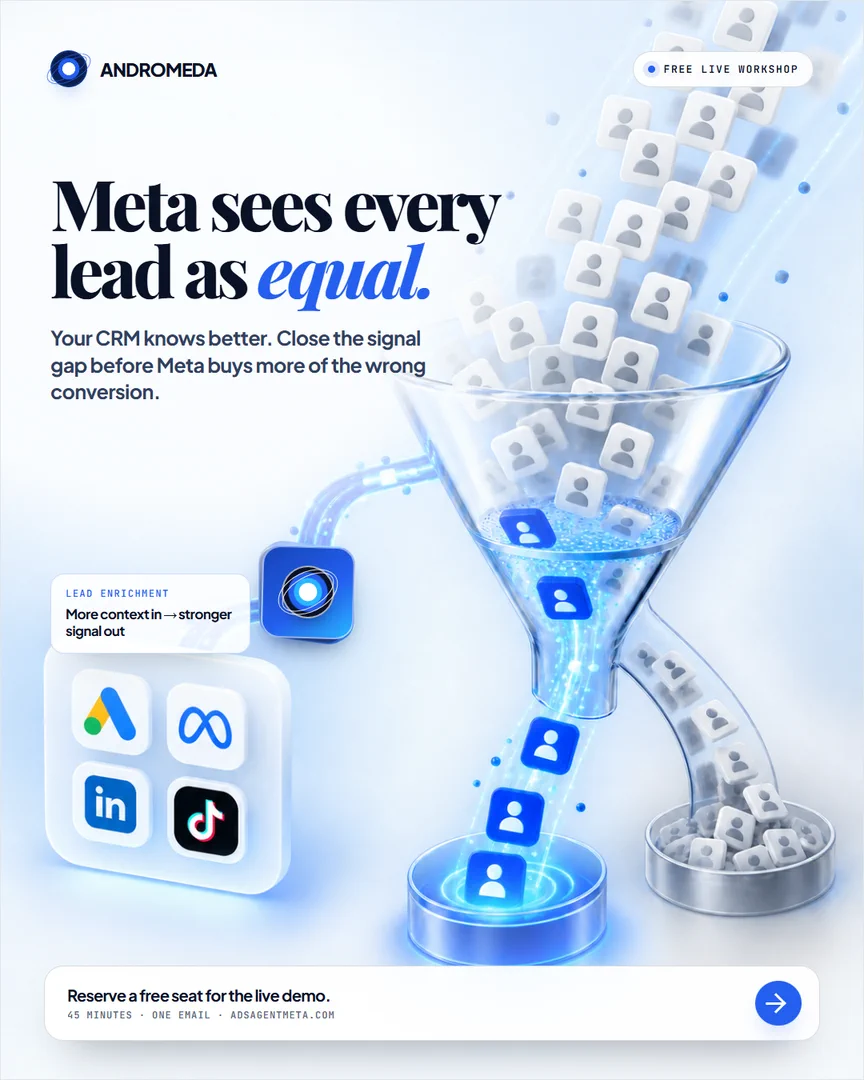
Core idea: “Meta sees every lead as equal. Your CRM knows better.” This concept turns missing lead-quality context into a physical funnel. Generic leads fall into the system, while enriched signal creates a clearer path to the outcome.
This is the most direct response-oriented concept because it connects platform optimization to a business consequence: buying more of the wrong conversion.
2. Creative convergence
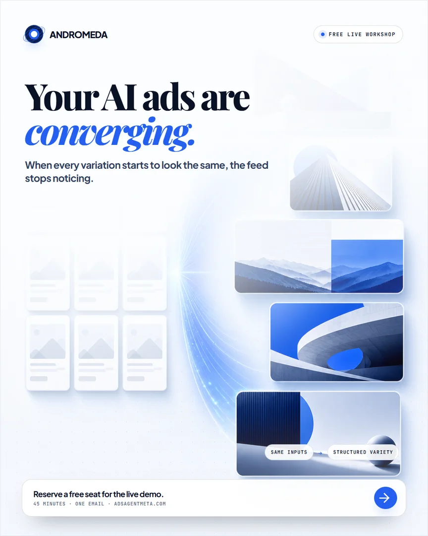
Core idea: “Your AI ads are converging.” Repeated muted cards on the left contrast with structured visual variety on the right. The composition makes sameness visible before the supporting copy explains why it matters.
This concept broadens the campaign beyond lead scoring. It speaks to a recognizable creative problem without requiring the viewer to understand the full product first.
3. Cheap lead, expensive outcome
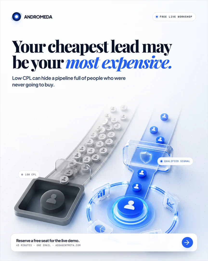
Core idea: “Your cheapest lead may be your most expensive.” Two lanes separate low CPL from qualified signal. The ad challenges a familiar optimization metric and reframes cost around purchase intent rather than form-fill volume.
It overlaps with the lead-quality concept, but enters through a different belief. One explains the signal gap. The other questions whether the cheapest reported result is actually the best business outcome.
A visual system with controlled variation
All five assets use the same recognizable building blocks: an editorial serif headline, electric blue emphasis, a bright technical environment, the Andromeda mark, and clear mechanism-based storytelling. Those repeated elements create campaign memory.
The mechanism imagery changes by concept. A lead funnel, a convergence field, and a two-lane qualification system make the three ideas visually distinct. That balance matters. A campaign needs enough consistency to feel related and enough variation to test a real difference.
Format and production decisions
- 4:5 static compositions use more vertical feed space than square assets.
- 9:16 videos are built intentionally for full-screen short-form placements.
- The primary business problem appears in the first headline or opening beat.
- Burned-in captions keep each video understandable with sound off.
- Every visual explains a mechanism rather than adding decorative stock imagery.
- Self-hosted review files preserve the 1080 × 1350 and 1080 × 1920 production formats.
How the first paid test should be read
The cleanest initial comparison keeps the audience, optimization event, landing page, offer, primary-text structure, and 4:5 format consistent. The creative hypothesis is the main variable. That does not produce a perfect laboratory experiment, but it makes the first result far more interpretable than changing every campaign input at once.
The lead-quality concept is the strongest direct-response control. Creative convergence can test a broader pain, while the cheap-lead concept acts as a challenger once budget is sufficient to give each asset a meaningful read.
This page documents the creative logic and finished deliverables. It does not claim click-through rate, cost-per-lead improvement, qualified-pipeline growth, or revenue impact.